The cryptocurrency market is unpredictable and in many cases can be compared to the Wild West, where much of what is allowed is prohibited in regulated markets. Due to the possibility of using much higher leverage, many traders experience the unpleasant feeling of forced liquidation. The Bitcoin Liquidation Map is a visual tool that helps you identify critical levels on the chart and allows you to enter the market more intelligently and consciously, thus liquidation maps can be extremely helpful in avoiding the annoying liquidation.
What is Liquidation in Crypto Trading?
In cryptocurrency trading, liquidation occurs when the exchange automatically closes out a trader’s leveraged position because they are unable to cover their losses. This typically occurs when the market moves strongly in the opposite direction.
A great way to avoid such pitfalls is to study the Bitcoin liquidation map.
What is a Bitcoin Liquidation Map?
A Bitcoin Liquidation Map is a visual “heat map” that shows price levels where large amounts of liquidation are expected. Significant leveraged positions may be automatically closed at these levels.
CoinGlass, for example, offers such maps that display this data in real time.
Such a map helps:
- in applying profitable breakout trading strategies
- in setting stop-loss levels precisely,
- in exploiting liquidity zones to maximize profits,
- in optimizing large position entry without slippage,
- in predicting potential price reversals.
How does the liquidation map work?
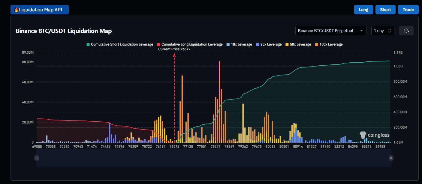
The horizontal X-axis of the liquidation map shows the amount of leveraged positions accumulated at which price levels. The colors indicate which exchange they are located on – this is less important information.
On the left are long positions (their average is marked with a red line) – which, if liquidated, push the price down.
On the right (the average is marked with a green line), are shorts, which naturally push the price up in the event of a liquidation avalanche.
The higher a bar is on the Y axis, the more it can swing the price in one direction or another.
So, if BTC reaches the value indicated on the X axis, that will be the center of the X axis (indicated by the red dashed arrow). What was a leveraged position at that price will be closed. If it knocks out a larger bar, it will significantly push the price up even more. If there is also a larger bar at the next level, that will also push it further – and a liquidation avalanche can start.
Best way to use it in your trading strategy
Identify risk zones: Don’t open too many leveraged positions where mass liquidation is expected – these price zones are dangerous.
Time your entry and exit: Try not to enter when too many people have already opened a position at a given price level – rather before or after it.
Use other technical indicators: Combine the map with RSI, support-resistance levels and moving averages!
Don’t fall into the trap of crowd psychosis: Overcrowded zones often hide traps – this is where big players profit from predictable mass liquidations.
It can also indicate reversals: Large liquidation waves are often followed by a trend reversal. Be alert and prepare for a rebound.
Helps with risk management: Liquidation zones help you determine your stop-loss more precisely.
Conclusion
Overall, Bitcoin liquidation charts provide information that most people don’t take into account. This is why they can be a useful tool in developing a trading strategy. But remember: like other indicators, they cannot predict where the price will go next. However, for those who are knowledgeable, they can be a useful tool that can be used well when put into context and as part of a complex, conscious trading system.
Related posts:
 Monero (XMR): Everything You Need to Know (2026)
 Doji Patterns in Technical Analysis – The Ultimate Guide
 Is Monte Carlo Simulation useful for Crypto Trading?
 What is a digital credit, and why is it set to take off in 2026?
 Relative Strength Index: The Ultimate Guide for Beginners
 Rising Wedge Pattern – What Is It, And How Do You Trade Using It?